Using Madder Brown In Landscapes
Published on: November 21, 2025
As a result of the color mixing experiment that I discussed in my previous blog post, I had several small piles of paint that I did not want to see go to waste. I also had one 18" x 24" canvas left. This seemed like a good opportunity to make use of the colors I had mixed and see what I could create
The result was Just Outside Town, a rural winter scene. (You can see the finished work here.)
To showcase just how versatile this color is, Madder Brown is used extensively in fiery orange color of the sky, the brown cabin, and the red of the barn. It is also featured in the barren trees and the dirt underlying the frozen road.
Colors used in this painting: Madder brown, Ultramarine Blue, Permanent Sap Green, Bright Yellow Lake, Zinc White, & Titanium White
Michael Harding Madder Brown - The Color That Is Two Colors In One
Published on: November 17, 2025
In the past, I have relied primarily on burnt umber or sme variant thereof for when I need brown on my palette. Burnt umber is extremely versatile and remains a key color for my landscapes. That being said, I have recently been introduced to Michael Harding's Madder Brown (No. 317) and I would like to talk a little bit about this unique color.
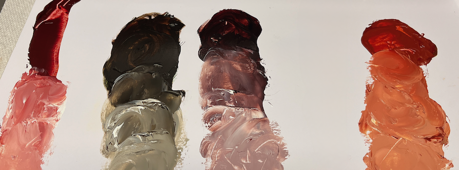
To say that there is no color like this would be a considerable understatement. This color is comprised of two pigments, quinacridone magenta and iron oxide. That gives it a unique color profile, in that on the one hand, the mass tone is brown, but when spread out on the palette or canvas, is a striking red color. This makes for some interesting mixes!
In the image below, you will see four color swatches that I mixed. The first mix (on the far left) is Madder Brown tinted with some zinc white. This produces a very organic, natural looking pink that would work well for painting florals and portraits. The resulting color does not go dramatically to the orange or violet side, but stays fairly neutral.
Moving to the right, I have mixed Madder Brown with some sap green and also created a tint of this mix with some zinc white. The result is a green that is relatively desaturated and would work well in landscapes or underpaintings.
The third mix is Madder Brown and ultramarine blue, once again tinted with some zinc white. This has created a variant of brown that is darker in value but still retains a great deal of warmth. It's almost like burnt umber but with some subtle violet undertones to it. This would be equally useful for landscapes and portraits.
On the far right is a mix with Michael Harding's Bright Yellow Lake and zinc white. I made this largely on intuition- I suspected it would create something interesting and I was not disappointed. The initial mix, without adding white, reminds me of persimmon. Adding zinc white produces a tint I would call carrot-like.
As you can see, this is an extremely versatile color. Will it replace burnt umber on my palette? Most likely not. That being the case, it has a lot of properties that burnt umber does not have, so I will use it as a supplementary color
This color is especially compelling for a floral or portrait artist. The ranges of pinks and flesh tones that Madder Brown can facilitate makes it a compelling choice.